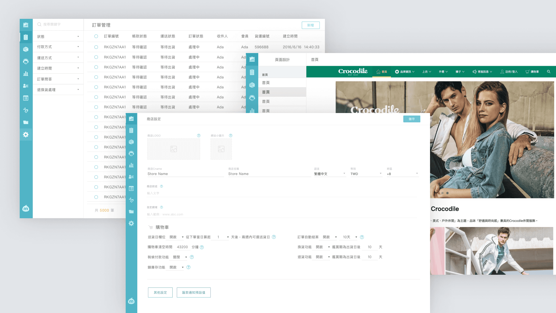
Design SYSTEM

Design SYSTEM

meepShop design system

meepShop design system

meepShop Design System is a scalable, component-driven UI framework designed to unify the visual and interactive experience across the meepShop e-commerce platform.

meepShop Design System is a scalable, component-driven UI framework designed to unify the visual and interactive experience across the meepShop e-commerce platform.

meepShop Design System is a scalable, component-driven UI framework designed to unify the visual and interactive experience across the meepShop e-commerce platform.

Company

Company

Duration

Duration

2018-2022

2018-2022

Role

Role

Senior Product Designer

Senior Product Designer

Background

When I joined, meepShop lacked a Design System, leading to fragmented UI components, inconsistent design patterns, and inefficiencies in collaboration. Each page had its own design language, and the absence of a shared component library made scaling and maintaining the product increasingly difficult.

My Role & Approach

I led the frontend UI revamp initiative, working closely with the engineering team to establish a scalable Design System and modernize the frontend architecture with Ant Design. This involved:

Standardizing UI components to unify the product’s look and feel

Standardizing UI components to unify the product’s look and feel

Standardizing UI components to unify the product’s look and feel

Standardizing UI components to unify the product’s look and feel

Defining a cohesive design language to enhance usability and consistency

Defining a cohesive design language to enhance usability and consistency

Defining a cohesive design language to enhance usability and consistency

Defining a cohesive design language to enhance usability and consistency

Bridging design and development with clear documentation and guidelines

Bridging design and development with clear documentation and guidelines

Bridging design and development with clear documentation and guidelines

Bridging design and development with clear documentation and guidelines

Challenge

When I joined, meepShop lacked a Design System, leading to fragmented UI components, inconsistent design patterns, and inefficiencies in collaboration. Each page had its own design language, and the absence of a shared component library made scaling and maintaining the product increasingly difficult.

Impact

Leading meepShop’s design systems initiative by formalizing our practice and culture of systems thinking has benefitted our teams in multiple ways:

A Unified Visual Language

Reduced UI inconsistencies by 50%, creating a cohesive and predictable interface that significantly improved the overall user experience across the platform.

A Unified Visual Language

Reduced UI inconsistencies by 50%, creating a cohesive and predictable interface that significantly improved the overall user experience across the platform.

A Unified Visual Language

Reduced UI inconsistencies by 50%, creating a cohesive and predictable interface that significantly improved the overall user experience across the platform.

A Unified Visual Language

Reduced UI inconsistencies by 50%, creating a cohesive and predictable interface that significantly improved the overall user experience across the platform.

Accelerated Design & Development

Reusable tokens and components reduced frontend development time by 50%, enabling faster iterations and scalable, efficient product development.

Accelerated Design & Development

Reusable tokens and components reduced frontend development time by 50%, enabling faster iterations and scalable, efficient product development.

Accelerated Design & Development

Reusable tokens and components reduced frontend development time by 50%, enabling faster iterations and scalable, efficient product development.

Accelerated Design & Development

Reusable tokens and components reduced frontend development time by 50%, enabling faster iterations and scalable, efficient product development.

Stronger Team Collaboration

By introducing structured documentation and contribution guidelines, we improved communication between designers and developers, enhancing workflow efficiency.

Stronger Team Collaboration

By introducing structured documentation and contribution guidelines, we improved communication between designers and developers, enhancing workflow efficiency.

Stronger Team Collaboration

By introducing structured documentation and contribution guidelines, we improved communication between designers and developers, enhancing workflow efficiency.

Stronger Team Collaboration

By introducing structured documentation and contribution guidelines, we improved communication between designers and developers, enhancing workflow efficiency.

Building the System

To ensure seamless collaboration between design and development, I took the initiative to audit all platforms. This allowed me to effectively facilitate the reuse of design system styles and components, and to drive the alignment of our design libraries with code repositories.
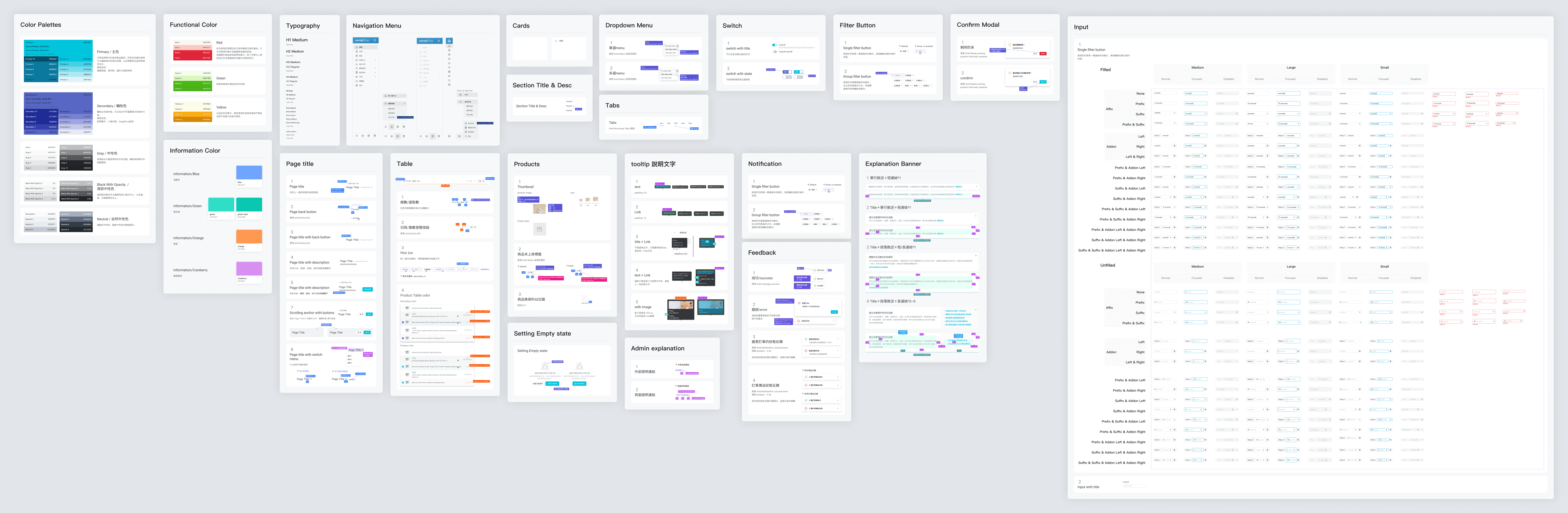
Design Libraries

Migrated from Sketch to Figma, creating a centralized design repository

Migrated from Sketch to Figma, creating a centralized design repository

Migrated from Sketch to Figma, creating a centralized design repository

Migrated from Sketch to Figma, creating a centralized design repository

Established a component-based Design Library to ensure consistency

Established a component-based Design Library to ensure consistency

Established a component-based Design Library to ensure consistency

Established a component-based Design Library to ensure consistency

Documentation & Guidelines

Developed usage documentation to standardize component implementation

Developed usage documentation to standardize component implementation

Developed usage documentation to standardize component implementation

Developed usage documentation to standardize component implementation

Created onboarding resources to align designers and developers on best practices

Created onboarding resources to align designers and developers on best practices

Created onboarding resources to align designers and developers on best practices

Created onboarding resources to align designers and developers on best practices

Implement

The introduction of a Design System significantly improved the product’s visual coherence and interaction consistency, ensuring a seamless user experience across different modules and pages.

Before

After